Waterloo redesigns packaging to stand out in crowded sparkling water category
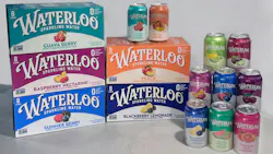
Waterloo Sparkling Water is rolling out new packaging across its beverage line to strengthen shelf visibility and make flavors easier for consumers to identify.
The redesigned cans introduce more saturated colors, a cleaner layout, stronger flavor cues and a more prominent brand mark, according to the company. The changes are intended to improve brand recognition and distinguish individual flavors in a crowded sparkling water category. The redesign follows consumer research that included multiple rounds of eye-tracking studies and testing across several creative concepts.
The packaging update comes as Waterloo reports business growth in 2026. Kathy Maurella, the company's chief marketing officer, said in a statement that the company achieved three times the category growth rate and a 17% increase in household penetration during the first half of the year.
The refresh is Waterloo’s first packaging redesign since the brand launched in 2017. The formulations remain unchanged.