Bevi rebuilds its interface around the drinker’s decision
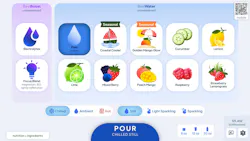
Bevi has redesigned the interface on its commercial beverage dispensers around how people actually choose beverages while simplifying an expanded menu for drinkers and operators.
In August, Bevi announced its new user interface, which was designed to streamline beverage selection and support the upcoming rollout of BeviPop, BeviSport and BeviEnergy. The redesign reflects Bevi’s shift from a water-focused brand built around replacing single-use bottles to a connected, customizable drink platform. Julien Levesque, vice president of product at Bevi, joined VendingMarketWatch.com to explain the shift.
Why Bevi wanted to redesign its user interface
Bevi kicked off its research by asking, “How are people using our machine today, and can we use it to make our user flow and journey easier?” Levesque said.

That question led to nearly two years of research that combined machine data with in-person site visits to observe people using the equipment. Bevi watched which buttons drinkers pushed, the order in which they made selections, how much they poured and where they appeared to hesitate. The company also combed through feedback it had received from users, operators and its own customer service team.
One finding stood out: The ability to get well-filtered, plain water was too easy to miss.
Levesque noted that fans of its flavored options “love to fight with each other about like, ‘This is the best flavor.’ ‘No, this is the best.’ ‘Oh, I need my electrolytes.’ That has really stolen the stage in terms of how people are talking about Bevi,” he explained. “But at our core, we have an amazing, delicious, really well-filtered water product.”
The redesigned interface adds a filtered water button directly on the home screen. For drinkers, it gives them a convenient shortcut to Bevi’s most popular pour.
Simplifying selection
Other changes were made to address usability issues. Levesque called this “sweating the pixels.” Every feature on the touch screen was evaluated both for how well it worked, and how it could function more effectively.
An example he offered was the intensity slider for the Bevi boosts and functionals. “It wasn’t super clear what that slider actually meant when it was in practice,” Levesque said. “We’ve moved that to a low, medium, high, and it’s just so much clearer what that actually means when you’re building your drink.”
He also highlighted another usability issue: having to hold the button down to pour. Preset automatic-pour options let users select an 8-, 12- or 20-ounce pour without holding down the button.
Bevi also moved the temperature and carbonation controls closer to the pour button. The change reflected the sequence the company saw most often: Drinkers selected a flavor or boost first, then chose still or sparkling and adjusted temperature before pouring.
Levesque said some users accustomed to the previous layout questioned the move. While he acknowledged that some users may have a period of adjustment, “We just reordered them based on what we saw folks naturally doing.”
Organized around a broader menu
The redesigned user interface organizes beverage choices by category, whether a drinker wants a seasonal water flavor, a favorite custom combination or one of the new products. The new interface organizes the screen around those categories, then takes users deeper into flavors and customization. Icons and product imagery help users understand what they are selecting, while nutritional information remains available for those who want to look more closely.
Levesque described users as the “mixologist of their own destiny,” combining flavors and functional ingredients to create drinks that aren’t necessarily presented as standard packaged beverages.
“This is very much like a living, breathing product that will continue to grow and evolve and reshape as we, you know, shape where we’re moving as a company,” Levesque said.
Later this year, Bevi will debut new beverage options, including BeviPop, BeviSport and BeviEnergy. As the company pushes to become a connected, customizable beverage platform, the scalable menu is intended to streamline the user experience.
At a glance
Among the features the company incorporated to streamline selection are:
- Dedicated filtered water button
- Scrollable beverage menu
- Repositioned temperature and carbonation controls, better reflecting what their market research told them about how drinkers made their selections
- Pre-set, automatic volume pour options, allowing drinkers to dispense beverages without holding the pour button
- Inline and adjacent nutrition data that updates as selections are made.
- A “clear” button to start over quickly, rather than having to unselect previously selected options
About the Author
 Linda Becker
Linda Becker
Head of Content
Linda Becker is head of content for Automatic Merchandiser and VendingMarketWatch.com, responsible for the brands’ overall content strategy, planning and performance. She oversees the creation and performance of editorial and multimedia content across platforms such as magazines, websites, webinars, podcasts, newsletters, videos, social media, events and eBooks.
Since joining Automatic Merchandiser and VendingMarketWatch.com, Linda has developed a new appreciation for the convenience services industry and its essential role. She is dedicated to serving readers by covering the latest news in the vending, office coffee service and micro market industry. She can be reached at 262-203-9924 or [email protected].